Digital AccessibilityTransformation
How we used post-it brainstorming to reimagine physical conversation cards as an inclusive digital experience
The Challenge
Transform popular physical conversation cards into an inclusive digital experience without losing the spontaneity and warmth
The Problem
Physical cards create barriers: people with visual impairments can't read them, those with motor disabilities struggle to shuffle and draw, and the product can't reach users who don't have physical access. How do you digitize something tactile without making it feel cold and impersonal?
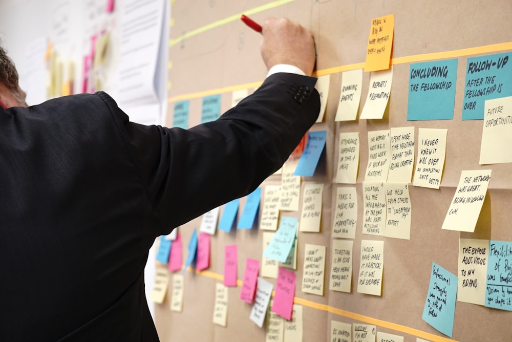
Ideation Through Post-Its
How we came up with solutions that work for everyone
Our Brainstorming Process
Problem Collection
Every barrier identified on individual post-its. Visual, motor, cognitive, social barriers all mapped out.
Solution Clustering
Grouped related solutions together. Screen reader support, large touch targets, keyboard navigation themes emerged.
Magic Preservation
Separate post-its for keeping the surprise, delight, and social aspects of the original cards.
Research Insights
Who We Talked To
- Screen reader users
- People with motor disabilities
- Users in remote locations
- Low-vision users
Key Insights
- Wanted clear, descriptive audio
- Needed simple, large touch targets
- Valued surprise and delight
- Social context mattered
The Solution
Inclusive design that works for everyone
Screen Reader Optimized
Every element properly labeled with clear, descriptive text
Keyboard Navigation
Full functionality accessible without mouse or touch
High Contrast Mode
Automatically adjusts for users with low vision
Large Touch Targets
All interactive elements minimum 44x44px
Motion Preferences
Respects prefers-reduced-motion settings
Flexible Text Sizing
Interface adapts to user's preferred text size
The Outcome
Created a digital experience that expanded who could use the product while maintaining the warmth and spontaneity of the physical cards. Screen reader users could now participate fully. Users with motor disabilities found it easier to use than physical cards.
Impact
Made the conversational card experience accessible to users who were completely excluded before. Proved that accessible design doesn't mean boring design. You can meet WCAG standards while creating delightful experiences.
What I Learned
Post-it ideation works
Physical post-its helped us see patterns and connections we missed in digital brainstorming.
Accessibility is design, not an add-on
When you bake it in from the start, it's actually easier and creates better UX for everyone.
Test with real users
Screen reader testing on my computer didn't reveal issues that actual users found immediately.
Inclusive design has business value
Expanding accessibility literally expanded the market. More people could now use the product.